How to generate realistic infographics with Gemini
Infographics are one of the fastest ways to communicate complex ideas in a clear and visually compelling way. Traditionally, creating them required research, data structuring, and strong design skills. Today, with Gemini, you can generate realistic, data-driven infographics in minutes. This article explains how to use Gemini to produce high-quality infographics step by step from structuring your prompt to refining and exporting the final visual.
To generate follow these 7 steps:
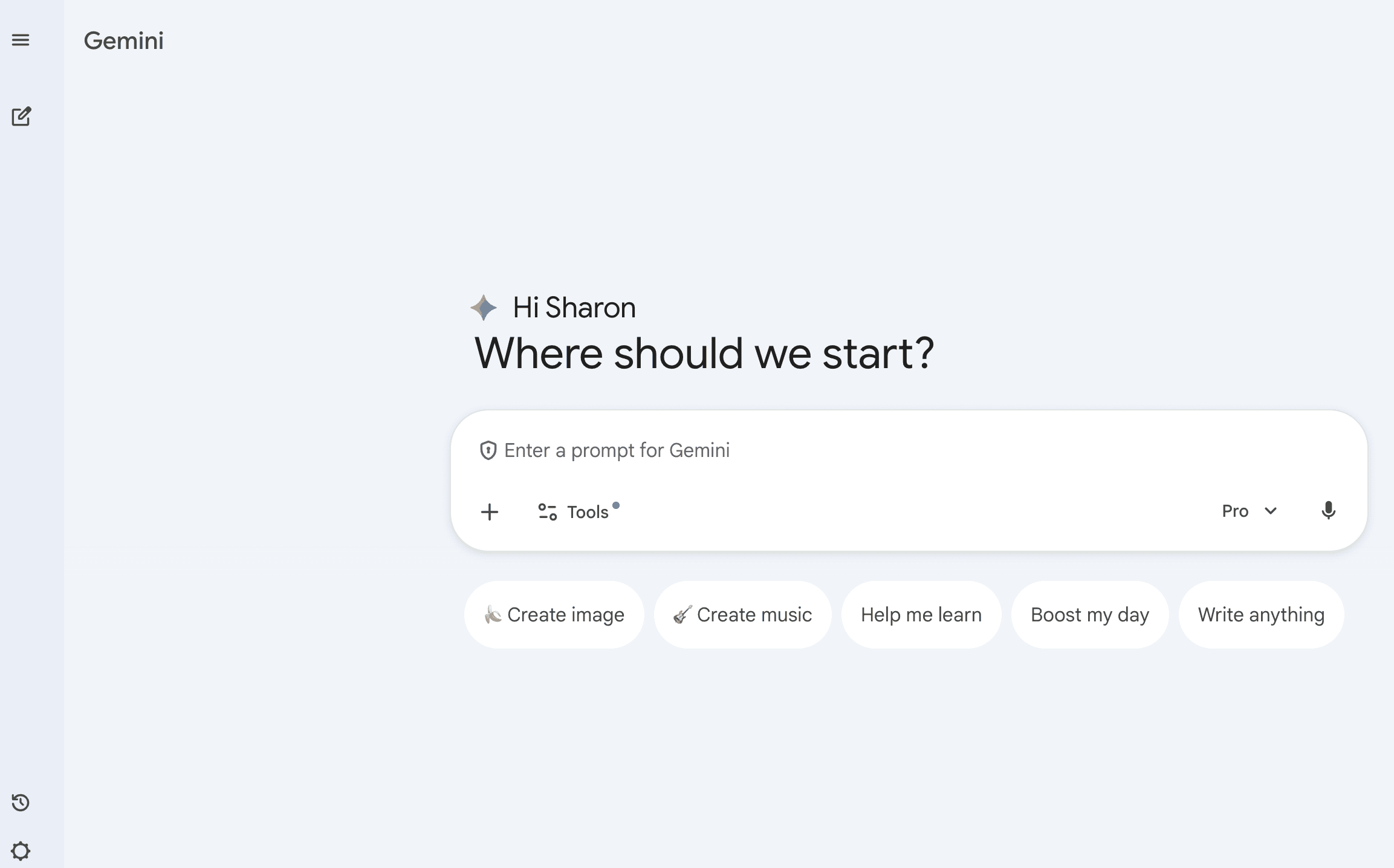
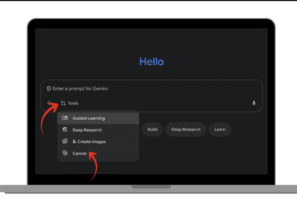
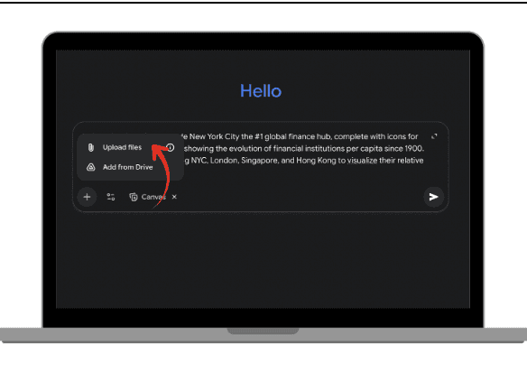
In Gemini, Click on settings and choose ‘Canvas’ to switch the mode to Gemini Canvas
Enter your prompt
If you have data insert it by copy pasting, or upload the file
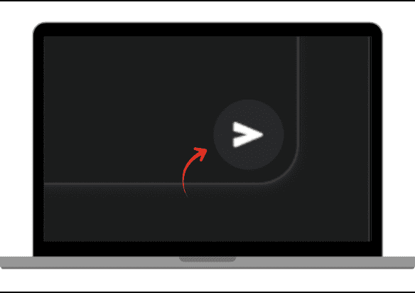
Click submit, and wait a few seconds for Canva to create
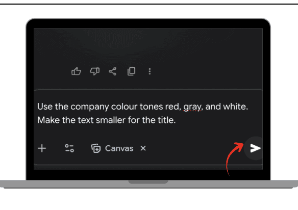
Review the creation and you can type in any changes you would like to be done. Such as color tones or text size.
Once completed, click download or export code in tools like Figma.


When you need to make a presentation to convince stakeholders, or prove your boss wrong or explain a complex idea in seconds, clarity matters. A well-designed infographic can make a message understandable at a glance.
The challenge is that traditional infographic creation requires:
Data collection and analysis
Clear storytelling
Graphic design skills
Time
Gemini changes that workflow. Instead of hiring both a researcher and a designer, Gemini can act as:
Your social or economic analyst
Your data interpreter
Your layout strategist
Your visual designer
In the next sections, we’ll walk through the exact steps to generate realistic infographics efficiently.
Why Use Gemini for Infographics?
It reduces research time
Gemini can summarize reports, structure messy information, and highlight key insights from raw data in seconds. This removes the most time-consuming phase of infographic creation: data synthesis.
It structures the narrative
An effective infographic is not just visual. It tells a story. Gemini organizes information logically, ensuring your visual content flows clearly from headline to conclusion.
It suggests visual layouts
Gemini can propose a wide range of visual formats, including pie charts, bar charts, flow diagrams, timeline structures, comparison grids, and funnel visuals.
This bridges the gap between raw data and visual storytelling.
Guide to Generating Realistic Infographics
1 : Clearly define your topic and instructions
Write the exact topic you want to explain, along with clear guidance. Make sure you are specific about the subject, precise about who the intended audience is, and avoid vague or generic directions. Provide structured, detailed instructions so the output aligns with your objective.
2 : Prompt structure to generate your Infographic
A strong infographic prompt follows a clear structure to ensure accurate and visually compelling results. It begins by defining the topic and the core objective, clarifying what insight should be immediately understood. It then specifies the target audience, since tone and complexity depend on who will view the infographic. Next, it outlines detailed layout requirements, such as format, comparison sections, chart types, and visual hierarchy, to guide the design structure. Including defined content sections ensures the information is organized logically, while precise design style instructions control aesthetics, tone, and visual balance. Finally, the prompt sets expectations for accuracy and realism, ensuring the infographic remains fact-based, visually coherent, and presentation-ready.
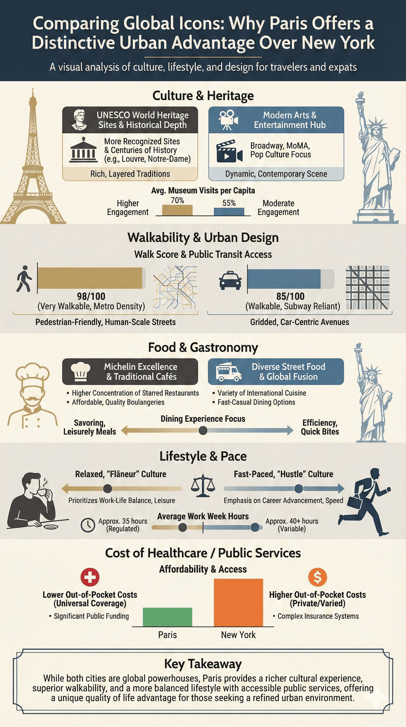
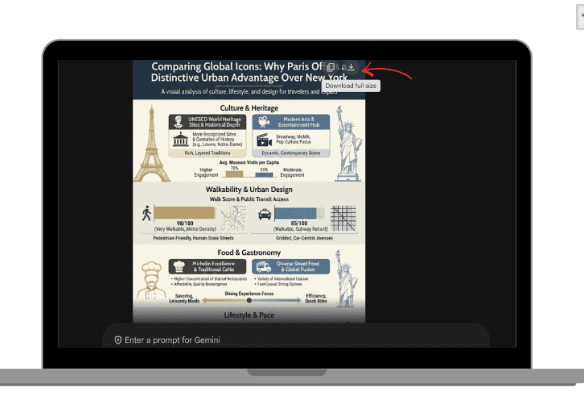
PROMPT : Create a realistic, visually striking infographic image comparing Paris and New York.
Topic: Why Paris is considered a better city than New York.
Objective: Highlight key advantages of Paris in culture, lifestyle, urban design, and quality of life.
Target Audience: Travellers, expats, and urban lifestyle enthusiasts.
Layout Requirements:
Vertical format
Bold headline at the top
Side-by-side comparison sections (Paris vs New York)
Use bar charts, comparison grids, and icon-supported facts
Highlight Paris advantages visually
Add a final “Key Takeaway” box at the bottom
Sections to Include:
Culture & Heritage
Walkability & Urban Design
Food & Gastronomy
Lifestyle & Pace
Cost of Healthcare / Public Services
Design Style:
Modern, elegant, European-inspired color palette
Realistic labeled charts with percentages or data points
Clean spacing and structured layout
Use cultural icons (Eiffel Tower silhouette vs Statue of Liberty outline) subtly
Tone:
Confident, informative, not aggressive. Avoid exaggeration. Use balanced comparison language. Ensure the infographic is visually balanced, presentation-ready, and fact-based.
Once you’ve entered your prompt, submit it and allow Gemini to generate your infographic.
3 : How to generate your infographic in Gemini Canvas
To generate follow these 7 steps:
In Gemini, Click on settings and choose ‘Canvas’ to switch the mode to Gemini Canvas.
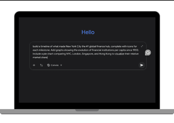
Enter your prompt.
If you have data insert it by copy pasting, or upload the file.
Click submit, and wait a few seconds for Canva to create.
Review the creation and you can type in any changes you would like to be done. Such as color tones or text size.
Once completed, click download or export code in tools like Figma.
 |  |
|
|
 |  |
|
|
 |  |
|
|
Conclusion
Creating impactful infographics no longer requires advanced graphic design skills or hours of research. With Gemini, you can transform raw information into clear, structured, visually convincing content in minutes. Whether you’re a student visualizing class results or an office worker preparing a monthly report, Gemini helps you turn plain numbers into clean, professional visuals, fast and effortlessly.
Leave a comment :
No comments yet. Be the first!


